I rhapsodized about the goodness that is (will be) the Apple iPhone a few posts ago.
It looks as though one of the other third-order iPhone effects I've been hoping for is coming to light, too: pressure on other vendors to improve their products.
Viz.: I downloaded yesterday and installed Spb Mobile Shell, a blandly-named but important application for Windows Mobile 5 by Spb Software House, a development outfit whose offerings figure prominently in my daily smartphone use. Spb Mobile Shell is what will eventually be a replacement for the stylus-heavy Start Menu and its ugly sibling, the scroll-to-see-more-info, squint-to-see-the-tiny-text Programs application.
Examples
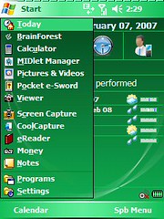
Compare these two screen shots:
| Before | After |
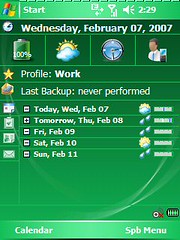 | 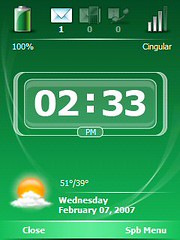 |
The shot on the right is the new "Now" screen from Spb Mobile Shell. Much simpler and clearer, no? It eschews loads and loads of data for the stuff that is most important to show on a cell phone, and I can even hide the weather data or show the next upcoming calendar appointment if I choose. It also, by default, is the first thing you see when you turn your phone on.
Now, consider these two shots:
| Before | After |
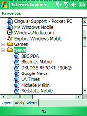 | 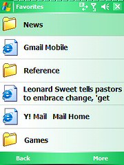 |
On the right you have the Favorites view as presented by Mobile Shell. Much less information, but each of the lines is big enough to be touched easily with a fingertip on a small screen. Also, take note of the white-on-green "Back" and "More" entries at the bottom of the screen. They're touch-sensitive areas, though small, but more importantly they represent actions that are mapped to "soft buttons" on the smartphone itself. There's actually a little physical button (mandated by the MS Smartphone spec) located beneath each word that, when pressed, triggers the action in question. So I can now go forward and back in the list of Favorites, quickly, using physical buttons I can find in the dark. Back on the touchscreen, touching a folder jumps me to a list of that folder's Favorites, and so forth. When I finally touch a Favorite, it opens Internet Explorer and I'm taken right to the web page in question. Also, I can get to the shell's Favorites list without having to open the browser first: I pick the Favorite I want, and then the browser opens. Much faster, and more efficient.
Basically, it's much quicker to use almost everything on the phone using the new shell: the touchscreen is useful, suddenly, without pulling out the device's stylus; buttons on the device become much more functional for navigation; it's possible to see what you're doing while holding the phone at arm's length; the list goes on and on.
Here are a few more examples:
| Before | After |
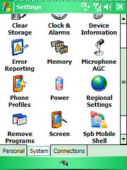 | 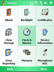 |
Okay, last example, but easily my favorite.
| Before | After |
 | 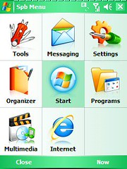 |
On the right we have Mobile Shell's approach: the same three-by-three grid as before, with good jumping-in points for common smartphone activities. Finger-navigable, fast, clear, efficient.
Summary
Spb Mobile Shell is a simple little app, that does a few important things extremely well. I've only had it installed for about a day, now, and it's already changed the way I use my Cingular 8125. The individual parts of the Windows Mobile experience haven't been fixed or changed (I still hate the MMS message-composition app), but the navigation "glue" among them has been revolutionized.
I've even started using a few little apps that I knew were part of Windows Mobile (Notes instead of Word Mobile is the best example), because they're so much easier to get to through Mobile Shell that they're worth using.
Kudos to Spb for making it happen, even in SpbMS's current 1.0 state.
Demerits to Microsoft, Spb, and the entire smartphone universe for requiring the iPhone to debut before getting it done.
-Rich
No comments:
Post a Comment