Big deal, right?
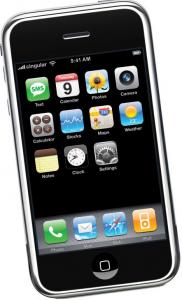
 Well, possibly. At right is a picture of the thing. You can't easily tell from the picture, but it's a touchscreen device, about 4.5" long by 2.4" wide, by a little less than half an inch thick.
The keynote address during which Steve Jobs introduced the iPhone is here, and Apple's product page for it is here. Put simply, it's an impressive-looking product: it's got all the media capability of an iPod (and then some), it makes phone calls, and it's got most of the e-mail, text messaging and web browsing capability of a typical smartphone--more in some areas, and less in others.
iPhone is an exercise in design minimalism in some ways (as Apple products frequently are): aside from volume, mute and power buttons along the edges of the device, there's only one "hard" button on the thing, and that's the circular depression with the square in it near the bottom, for "home." The rest of the buttons on the thing are images displayed behind the touch-sensitive glass screen.
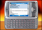
 But there are already lots of touchscreen smartphones out there in the wild. Heck, the one I have is pictured at left. It doesn't even look too dissimilar, if you slide it closed to hide the keyboard: few hardware buttons, decent touchscreen, a fair bit bulkier; but it does calls, multimedia, e-mail, texting, browsing, the whole smack.
I've been happier with my Cingular 8125 (dubbed "DontPanic") than with any other phone I've owned--the smartphone concept works, at least for technoids like me. But, you see, that's the rub: current smartphones require a technoid like me--I back the device up at least once a week, and every eight weeks or so I wipe the thing's memory and restore it from a backup, just to clear out the cobwebs. All of the core bits of DontPanic's smartphone functionality--calls, media, texting, browsing, even the camera--need babying and customization (I frequently refer to it as overcoming use friction) to work well. Also, it's bitingly clear that different parts of the device were developed by different teams, even different companies: the MMS (multimedia) message composition program is glaringly different from the rest of the e-mail system, for example. Also, Internet Explorer Mobile can handle simple, static pages without much trouble; but complicated pages, or ones that require user interaction (like the login mechanism for the Bank of America site, or the Blogger post editor) work awkwardly or fail to function at all. The experience feels patched-together and just-working. It works, but it's not clear, it's not simple, and it's certainly nothing I'd call elegant.
Put another way, the hardware is willing, but the software is weak. :-) All these myriad bits of friction add up to an occasionally frustrating user experience, but I don't really mind, because I'm a tech geek, and to an extent I enjoy the involvement in my device's functioning, and because I can get the elephant to dance and dance well the vast majority of the time.
But most people do mind the friction. Most of us hate the interfaces our cell phones present to us; most cell phones can do text messaging and simple mobile web stuff these days, and some of us (mostly savvier teens and geekier gen-X'ers) use that capability, but the majority of us don't. Ditto address books, ditto calendars and reminders, ditto simple web tricks like checking the weather or finding the closest movie theater and its movie listings.
Apple might indeed be poised to change that expectation of friction. I hope dearly that the iPhone does for expectations of cell-phone usability what the iPod did for portable digital music players. Apple's known for putting wondrously elegant and usable interfaces on its hardware, which is itself often merely better-than-average. The demos I've seen of the iPhone leave many questions answered (how well can an onscreen QWERTY keyboard, with no physical feedback, work for heavy text messaging?), but the slickness of the address book and call-making functionality are already miles better than anything else out there. The demo Jobs did of the web browser nearly brought a tear to my eye: not a subset of the web, but a full browser (Apple's Safari: not the best, but leagues better than IE Mobile), with zooming in and out to facilitate use on a phone-sized screen. This is the sort of software innovation that smartphones need to be truly useful, and accessible to the non-geek crowd.
Basically, if I can get 85% of the functionality of DontPanic on an iPhone, and it wreaks the kind of interface havoc I expect it to, I'll buy one. The price will have to fall about 30% first (they debut at $499 with a 2-year Cingular contract), but I'll pay a certain premium for elegance.
There's another factor, here, too. Sales of desktop computers are in free-fall, and notebook/laptop computers are now responsible for most of new-computer sales, which are flattening year-to-year. There's one device that nearly every adult in the industrialized world carries, though, and that's their cell phone. There's no reason that cell phones have to resemble current models, however: they can look like pretty much anything, so long as it fits in a purse or a pocket. You don't even really have to hold them to your ear any more, with the advent of hands-free headsets, both wired and wireless.
I posit that the iPhone can be the harbinger of the next generation of computer. Small, portable, internet-aware, presenting a mutable-by-need touch interface to the user, packed with solid-state storage. Also, possibly in future models, dockable to a bigger display, connectable wirelessly to a keyboard and mouse, capable of being (or mirroring) one's main computer, and available anywhere you carry it.
Here's hoping.
-Rich
No comments:
Post a Comment