Pages

Thursday, February 22, 2007

Mobility; Lent

Lent
Yesterday was of course Ash Wednesday, if you're the sort of person who celebrates it. For those not in the know, Ash Wednesday marks the beginning of the season of Lent for many Christians.

It's customary during Lent to give up something you like to do, or would normally do, in order to remember Christ's sacrifice for us, and also to get into the purifying spirit of Lent, wherein we focus on our spiritual development and ask God and ourselves, "so how am I doing?"

We're not supposed to brag about or make much of our sacrifices (wouldn't want to be confused with scribes or Pharisees, who already have their reward, having sacrificed openly), but one of the things Amy and I are doing is abstaining from TV on weeknights. This has already precipitated a few very good third-order effects, like doing a lot more reading and journaling.

I've finally picked up Mere Christianity again, for example, and am enjoying another trip into C.S. Lewis's mind. I had forgotten that it was written as a palliative for the English as they were being bombed during the German Blitz in World War II. Intense.

What do you want in a mobile device?
Of course, being back in a "reading mode" has got me doing more of it on my smartphone, and in turn thinking about how DontPanic functions.

I'm still very much enjoying the Spb Mobile Shell interface, and have rearranged a lot of the program shortcuts in DontPanic's Start menu for easier, categorized access. I'm getting more out of the device than I have since buying it, and so I've begun putting some thought into how I use the little guy, and what more I might be able to get out of it, with a little effort.

The central question, I suppose, is: given a pocketable computing widget with a cell phone radio and data access, what are the things it's most useful to have it do?

Here are the things I use DontPanic for right now, in rough order of importance to me:
  • E-mail and text messaging
  • Telephony (phone calls and voice mail)
  • Calendar management and reminders/alarms
  • Address-book management
  • To-do list management
  • Calculator
  • Checkbook balancing (less frequently than I should)
  • Web access (from news to maps/directions to weather)
  • Note taking
  • Digital camera use
  • E-book reading (mainly Bible reading and lookups, but also some classics)
I don't currently use DontPanic for music storage or playback (too little space on the 1GB storage card I bought for it), or video media (same problem, only moreso, and it's underpowered for most video, to boot).

I also don't do as much writing or blogging on the beast as I might otherwise, which I think is a real shame. I like the unit's built-in keyboard well enough for short messages, but a Bluetooth (wireless) keyboard would help get around that issue.

I'd really like to be able to use DontPanic more effectively for things like online shopping. Sadly, most commerce sites (eBay, Amazon, etc.) work very badly--if at all--in Internet Explorer Mobile, and the few alternative browsers I've tried have provided very little improvement. Still, the last time I tried was a few months ago, so I should probably do so again.

[Edit, 8:30 PM - Looks like Opera Mini has solved most of its problems, making it my one-stop-shop now for Amazon, eBay, My Yahoo! and other heavily cookie-dependent and session-heavy sites. Huzzah! It's still a Java app targeted at Windows Mobile Smartphone Edition, though, which means it's wasteful of screen space and doesn't support soft-keys natively, but for online-commerce ability I'll put up with those!]

What do you, my readers, use your phones (smart or otherwise) for? What would you use a portable info-widget for, if it was arbitrarily well-connected to the internet, or capacious, or otherwise unlimited?

-Rich
Friday, February 09, 2007

Deer Damage to the Altima

Deer Damage
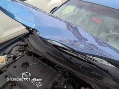
Back on the 27th of last month I had the misfortune to hit a deer while driving to pick up my lovely fiancée Amy. It was dusk, and rainy, and I never even saw the poor animal until my hood was flipping up from the impact. I saw a brief flash of the deer's head--no antlers, so this time of year I think that means a doe--and then I couldn't see anything but the top of my flipped-up hood.

The impact was at around 45 mph, so I don't have much hope for the deer. I never saw it leave the scene, but it was nowhere to be found by the time police arrived to take my report. I was unhurt, though briefly freaked out. The airbag didn't even deploy.

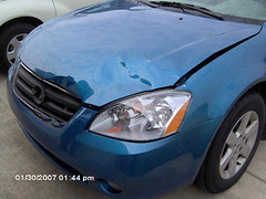
Cracked radiator, replacement hood, broken hood hinges, paint matching, damaged airbag sensor, cracked air ducts... The list goes on. The bill for the repairs has so far come to just shy of $6,000--GEICO has been fantastic, as has the repair shop recommended to me by my soon-to-be-brother-in-law.

AdjusterPic-212592853_P_3
These are some pictures the adjuster took of the damage. I confirmed with GEICO that posting them was OK, so now everyone gets to see the results. Oddly, it doesn't look so bad; the headlights were even functional as I limped the car the mile back to my house.

Lord willin' and the creek don't rise, I'll have the car back by the end of next week. I'm driving a rented late-model Volkswagen Jetta in the interim, after trying and rejecting a PT Cruiser as entirely too small. Nice car! Decent pickup, and full of nice VW appointments.

-Rich

Wednesday, February 07, 2007

Why I Will Always Love Steve Jobs's Apple, Inc. for Being a Disruptive Influence

Now this is what I'm talkin' about.

I rhapsodized about the goodness that is (will be) the Apple iPhone a few posts ago.

It looks as though one of the other third-order iPhone effects I've been hoping for is coming to light, too: pressure on other vendors to improve their products.

Viz.: I downloaded yesterday and installed Spb Mobile Shell, a blandly-named but important application for Windows Mobile 5 by Spb Software House, a development outfit whose offerings figure prominently in my daily smartphone use. Spb Mobile Shell is what will eventually be a replacement for the stylus-heavy Start Menu and its ugly sibling, the scroll-to-see-more-info, squint-to-see-the-tiny-text Programs application.

Examples
Compare these two screen shots:
BeforeAfter
sshot000sshot010
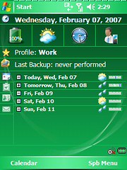
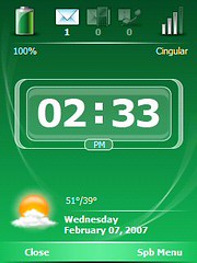
The leftmost shot is the standard Windows Mobile "Today" screen, with a few plugins I've installed to show the information most people would want to see. It's actually pretty clean compared to some. Bear in mind that my Cingular 8125's touchscreen is only 57mm tall by 44mm wide (a little less than 2.5"x2).

The shot on the right is the new "Now" screen from Spb Mobile Shell. Much simpler and clearer, no? It eschews loads and loads of data for the stuff that is most important to show on a cell phone, and I can even hide the weather data or show the next upcoming calendar appointment if I choose. It also, by default, is the first thing you see when you turn your phone on.

Now, consider these two shots:
BeforeAfter
sshot008sshot009
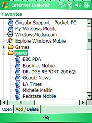
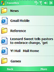
The benefit of the new approach is more subtle in this case. On the left you have the default Favorites (web bookmarks) view presented by Internet Explorer Mobile. Neat, orderly, clearly organized, but small, small, small, and requiring lots of scrolling and navigational effort to see more of the list. Heaven forbid you only have one hand free, or are working without your glasses, or what have you.

On the right you have the Favorites view as presented by Mobile Shell. Much less information, but each of the lines is big enough to be touched easily with a fingertip on a small screen. Also, take note of the white-on-green "Back" and "More" entries at the bottom of the screen. They're touch-sensitive areas, though small, but more importantly they represent actions that are mapped to "soft buttons" on the smartphone itself. There's actually a little physical button (mandated by the MS Smartphone spec) located beneath each word that, when pressed, triggers the action in question. So I can now go forward and back in the list of Favorites, quickly, using physical buttons I can find in the dark. Back on the touchscreen, touching a folder jumps me to a list of that folder's Favorites, and so forth. When I finally touch a Favorite, it opens Internet Explorer and I'm taken right to the web page in question. Also, I can get to the shell's Favorites list without having to open the browser first: I pick the Favorite I want, and then the browser opens. Much faster, and more efficient.

Basically, it's much quicker to use almost everything on the phone using the new shell: the touchscreen is useful, suddenly, without pulling out the device's stylus; buttons on the device become much more functional for navigation; it's possible to see what you're doing while holding the phone at arm's length; the list goes on and on.

Here are a few more examples:
BeforeAfter
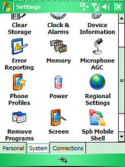
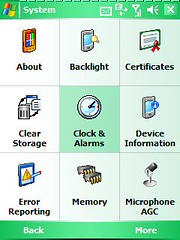
sshot003sshot006
The navigation scheme is becoming more clear now. From a denser, scrolling list with hierarchy expressed on the same screen, we move to sparser lists (more space for each item, making hitting areas with a thumb easier) that express list length and hierarchy through Back/More navigation rather than having to hit some far-off, small area on the screen (a scrollbar and/or tab, as above, or the "plus" to expand a tree as in the Favorites example) with a stylus.

Okay, last example, but easily my favorite.
BeforeAfter
sshot001sshot005
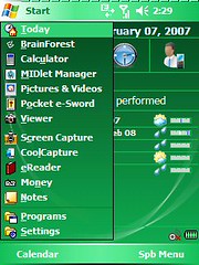
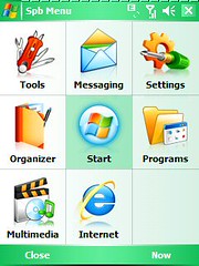
On the left we have the "Start" menu, staple of Windows navigation everywhere. It's meant to serve as the first-stopoff point for launching frequently-used applications, and as a most-recently-used list of the same applications. Great in theory, lousy in practice, because the elements are small, again, and tedious to navigate, again. Even with the directional button-pad on the device, it's just too laborious to do quickly, or efficiently. Forget trying to pick from the menu with a fingertip. Ain't happening, or at least not correctly more than about 60% of the time. I've been using this unit for a while, and the touchscreen is exquisitely calibrated. I know whereof I speak.

On the right we have Mobile Shell's approach: the same three-by-three grid as before, with good jumping-in points for common smartphone activities. Finger-navigable, fast, clear, efficient.

Summary
Spb Mobile Shell is a simple little app, that does a few important things extremely well. I've only had it installed for about a day, now, and it's already changed the way I use my Cingular 8125. The individual parts of the Windows Mobile experience haven't been fixed or changed (I still hate the MMS message-composition app), but the navigation "glue" among them has been revolutionized.

I've even started using a few little apps that I knew were part of Windows Mobile (Notes instead of Word Mobile is the best example), because they're so much easier to get to through Mobile Shell that they're worth using.

Kudos to Spb for making it happen, even in SpbMS's current 1.0 state.

Demerits to Microsoft, Spb, and the entire smartphone universe for requiring the iPhone to debut before getting it done.

-Rich

Friday, February 02, 2007

Absence of Evidence is not Evidence of Absence...

Absence of Evidence is not Evidence of..
I can stop any time I want. Truly. :-)

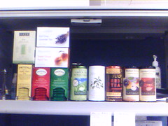
Yep, I've acquired a tea habit. This scene depicts the lamentable state of the shelf above a part of my cube at work.

I'm still adjusting to the barky taste of rooibos herbal tea, though a nice Twinings Earl Grey, Tazo Zen Green or Irish Breakfast will always brighten my day.

It's probably at least partially psychosomatic, but I'm feeling more awake and more creative, and little things about my health have taken turns for the better (not that they were bad) since beginning to slurp down four 20-oz. cops a day instead of carbonated aspartame-water.

Plus, hot water is free around the office. I'm saving money over sodas, honest.

I do need to bear in mind the admonitions of Robert Frezza's character Raul Sanmartin as regards tea, however. I'm in the middle of a reread of Frezza's seminal A Small Colonial War of late, and when I run across the relevant quote I'll post it here.

-Rich